With some netizens unhappy about PLDT and Smart’s new logo, Freelancer.com launched their own re-design contest, to see if someone else could have done better. Here are the winners.
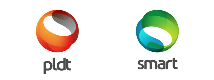
The winning re-design (above) is by Arvin Terrago, a designer from Daet, Camarines Norte. “The circles,” he explains, “represent unity, mobility, revolution, commitment, and community. Circles have a free sense of movement which also represent power and energy. Curved lines, ovals, and circles are graceful and complete. They give a sense of integrity and perfection.”
Here are the two runners up.
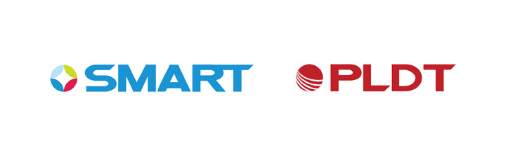
The design above is from Jimmy Jucar Jr., a Baguio-based designer. He used circles “to represent our world” and also to mean “a cycle” with “no end.”
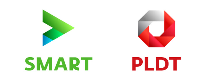
This last one is from Charz Mendoza, a designer from Manila. He says, “Relying more on the power of symbolism, this version is borne from the idea of connectivity–the individual shapes connecting together to form a mark that represents a strong union. The gradient overlays add depth to the whole identity, and it is done so without making the entire composition look cluttered. To add a playful element, the customized type (Fedra Sans) feels light and approachable despite the heavy weight.”
The winner gets the $150 top prize. Two runners-up get $75 each.
Liked this post? Follow SwirlingOverCoffee on Facebook.